Encompassing over 1,500 square kilometres, Greater London is one of the largest cities in Europe. As a newcomer to the city, choosing where to live can be daunting, let alone where to buy a home. That’s why I took an analytical approach to it, and will share my findings and methodology in this post.
The goal is to buy a home that serves not as an investment, in which case I would above all aim for a rapid appreciation, but as a home for myself. I’m looking to pay as little as possible for the best possible neighbourhood (or rather, the most suitable for me).
For this, I combined 3 sources of information:
- 2021 UK Census data to understand what each neighbourhood is like.
- Land Registry prices to understand how much it will cost me.
- Geographical location of stations in the London Underground network to filter those that are well served by the tube.
The analysis takes several steps. As a teaser, this is the final plot we will get to. If you want to understand how I got there, or what each colour means, keep reading that I explain all of it below.
A brief intro of related work
(Note: You can skip this section if you want to go straight into the analysis)
When looking at related data sources and analyses, I found a plethora of posts and sources analysing census maps. But I saw almost none doing anything much useful with that, beyond plotting one variable at a time. Furthermore, if what we want to see are census variables mapped one by one, we already have it done and published on the census site itself (see here).
In addition, in many posts, variables are mapped by Borough. That is not enough to give granular insights. Boroughs in London are huge, with central boroughs having an average size of 26 km2 each, and 38 km2 when including all boroughs in Greater London. I think it’s better to plot at the level of Ward or LSOA. In case you are not familiar with the terms, the Borough of Tower Hamlets explains them very well here.
Another common approach I found online was running a clustering algorithm to group LSOAs into different clusters using all census variables. This is interesting, and also more useful, but still not exactly what I needed, as I don’t have the autonomy to decide how clusters are formed or what exactly they mean.
And finally, I didn’t find any analysis combining census data with other data sources, as I do on this post.
The analysis – Step by Step
Step 1. Analyse Census Data
The 2021 census data is available online, and it includes a myriad of demographic variables. To give just some examples, we can find information for age groups, country of birth, languages spoken, religion, occupation, hours worked, method of travel to work, employment status, number of cars in the household, bedrooms, level of qualifications obtained, etc. I used the London Data Store for its convenience to download 2021 Census data for London, aggregated at LSOA levels.
I aimed to integrate specific variables of personal interest for me, combine them into a single score, and use this score to identify neighbourhoods that align with my personal preferences.
I used the following logic:
- Select variables
- Set a threshold for each of them. It may be difficult to know what value would be reasonable for each variable, so in many cases I defined them using quantiles. For example, “the LSOA should not be in the top 20% of highest unemployment”.
- For each LSOA, count for how many variables it surpassed the threshold. This count is our score. Some LSOAs may have passed all thresholds, some none. Most of them, somewhere in between.
- Finally, I normalised that score between 0 and 100 for all LSOAs.
Let me add that there is no such thing as a “best neighbourhood”. “Best” is subjective. A high score only indicates that they are more likely to be a fit for me in particular. I focused on variables for high education level, professional occupations, economic activity, and I also added age groups just to make sure there was no shortage of adults in their 30s-40s with children. I did not use most of the other variables, such as any variable for ethnic groups, religion, citizenship or migration status.
I then plotted this score over a map of London. Darker shades of Blue indicate higher scores:
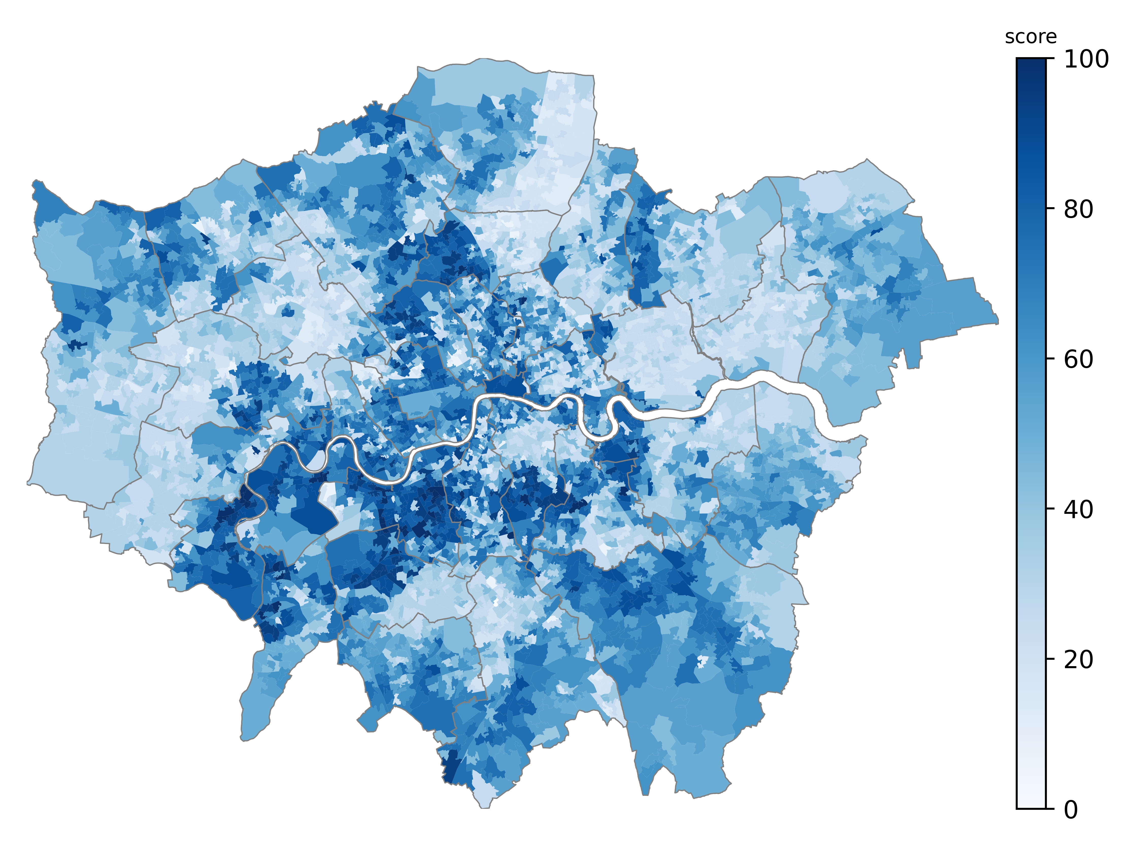 Census score for all LSOAs in London.
Step 2. Keep only LSOAs above a threshold
I needed to define a threshold for the score itself so that I could filter for LSOAs that surpassed it. For this, I checked the distribution of the score across London, and decided to use 55% as a threshold, which would equate approximately to the quantile 60% of that distribution. The selected LSOAs surpassing that level can be seen below in grey colour:
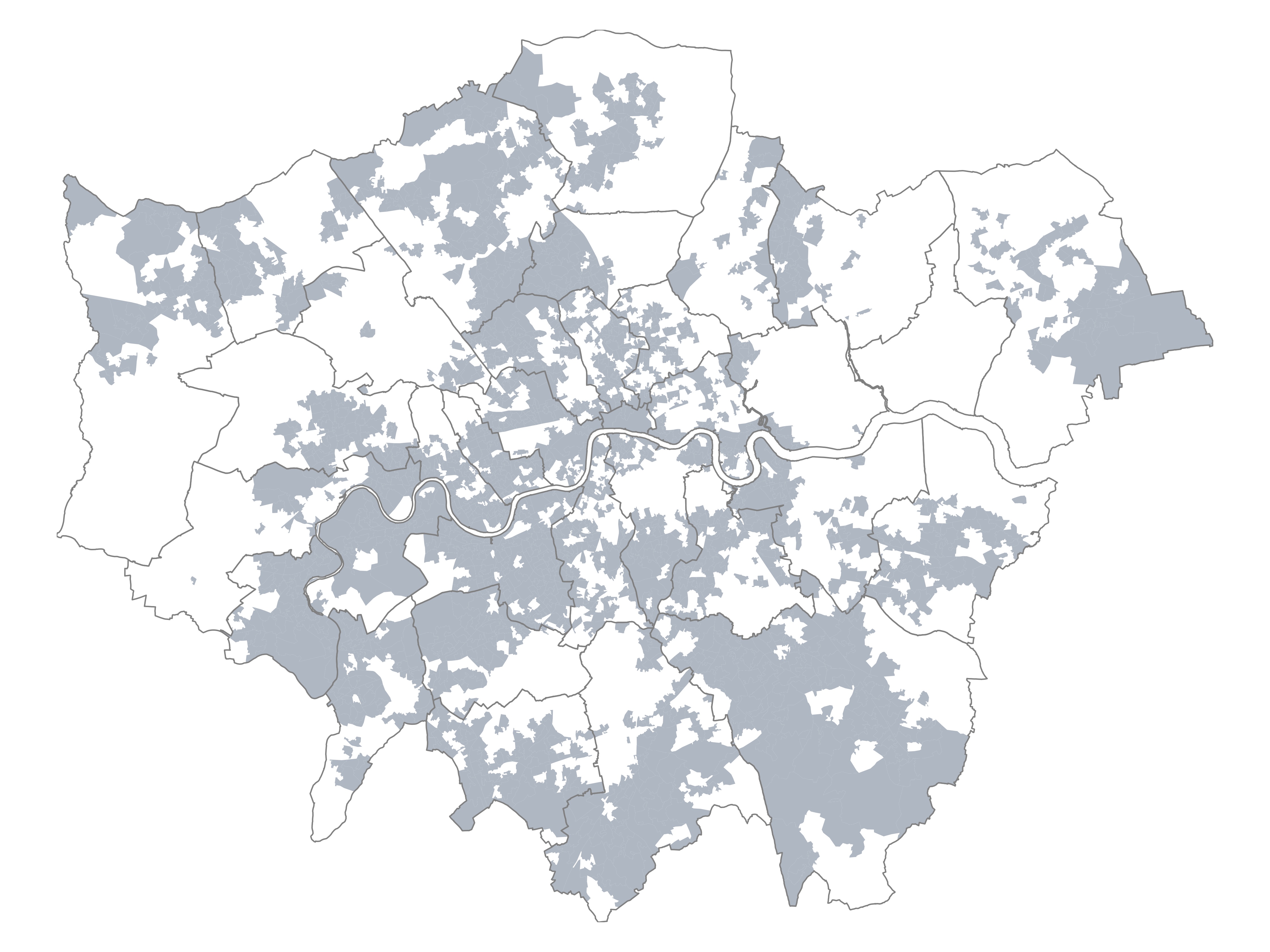 LSOAs with scores above the defined threshold.
Step 3. Add Underground stations
Something I consider important when looking for a place to live in London is access to the Underground network. Some neighbourhoods in the map from Step 2 may be nice areas, but if they are not at a walkable distance from a tube station, then they are not an option for me. The challenge was finding a geographical dataset of all tube stations that was updated, accurate, contained information such as line and zone fares, and was available for download. I couldn’t find a suitable dataset online, so eventually I downloaded the data myself from OpenStreetMap using QGIS. I decided not to include the Overground network in the data.
Once I had the locations of all stations, I created a buffer zone of a “walkable” distance around each station, of around 1000 metres. Of course, this is approximate, the real urban layout could mean that you may not be able to walk in a straight line to a tube station.
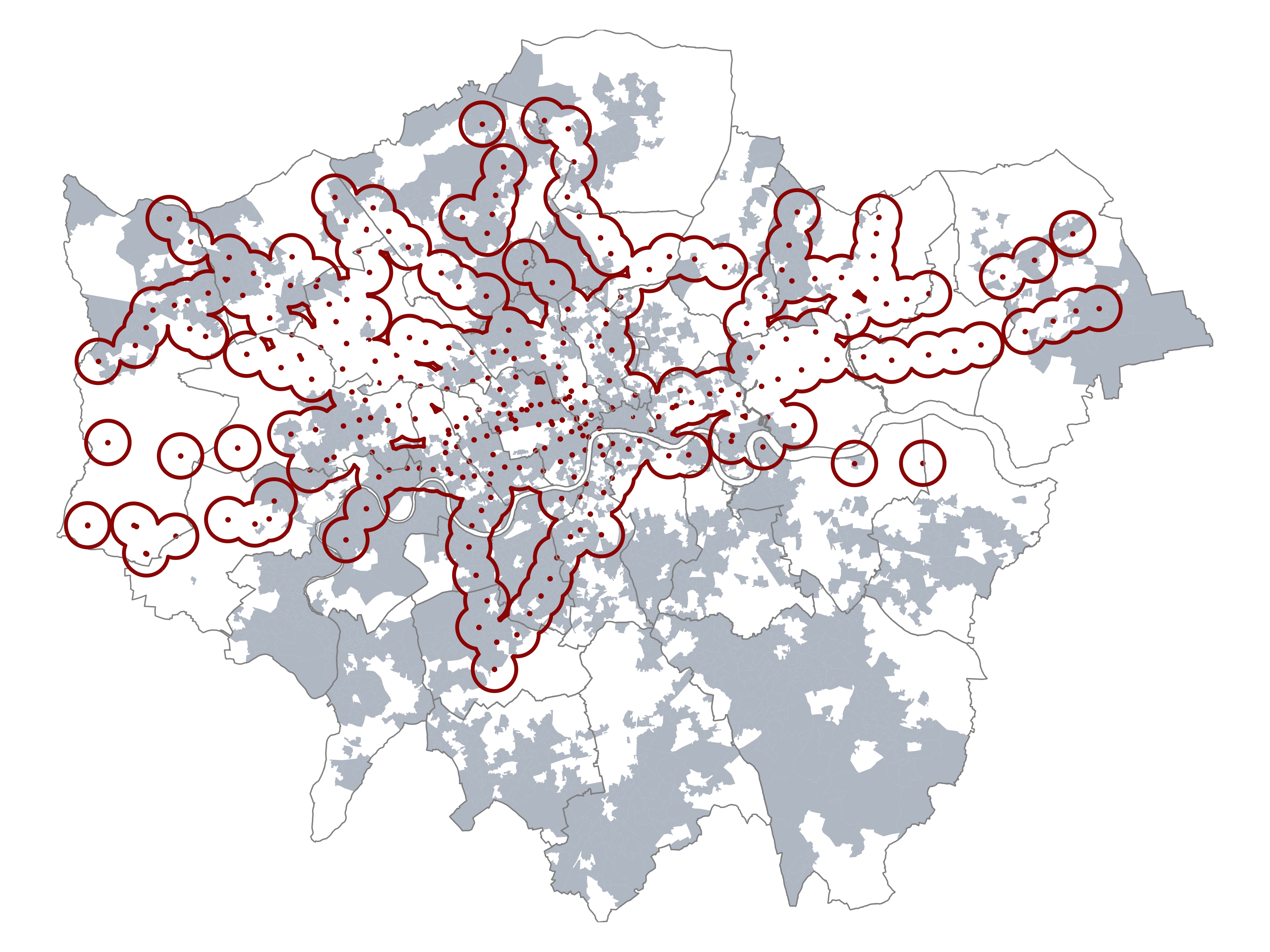 Walkable distance around underground stations, and LSOAs above the threshold.
Step 4. Only Zones 1-2-3
Not only I’m looking to live close to a tube station, I also prefer not to live further out than Zone 3. Farther than that and you start being too far from many places, in addition to increased travel fares. Zones are given by the Zone fares in the Transport for London network, and the metadata I downloaded from OpenStreetMap contains it.
I filtered for stations in Zone 1-2-3, and then created a convex hull wrapping them all on the map:
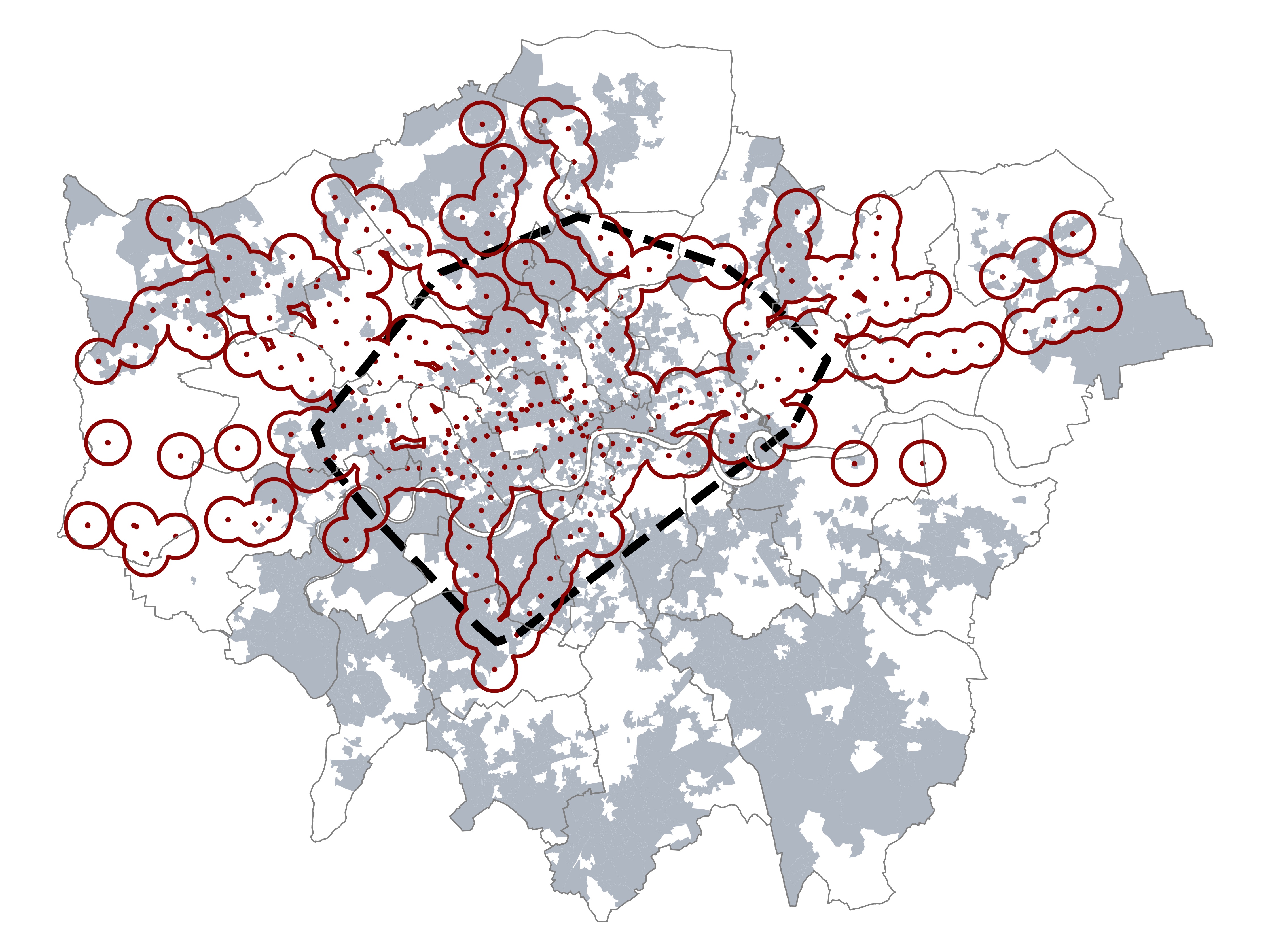 Underground stations, Zones 1-2-3 limits, and LSOAs above the threshold.
Step 5. Filter final possible LSOAs
Here I combined all the previous steps to keep only those areas that are above my census threshold, within walkable distance of a tube station, and not further out than Zone 3. The result of all possible LSOAs to look for a home can be seen in the map below:
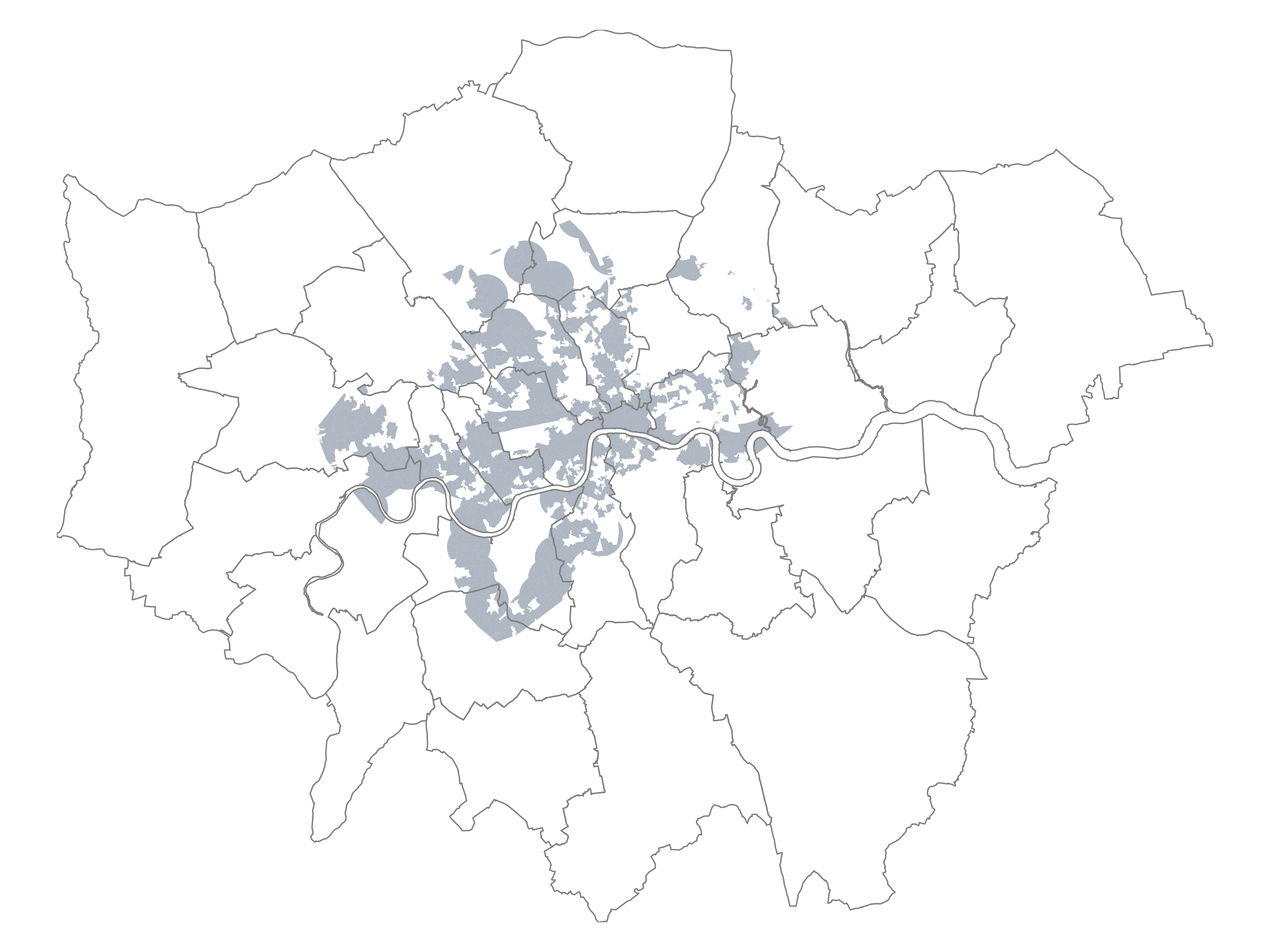 Filtered LSOAs above census threshold and close to underground stations.
Step 6. Add Price data
Now comes the final component of this analysis, which is analysing which of those resulting areas are more affordable. For example, the area around Hyde Park surely comes up as a good area with easy access to the tube, but price-wise it is well out of my reach and I would never even look for flats there. This makes it necessary to add average house price data for all these pre-selected areas.
I used a fantastic dataset created by authors from University College London and made available online here. They combined house transaction values from the Land Registry, with floor size of each home from Energy Performance Certificates (EPC), thus giving the price per square meter of every transaction available in the public Registry since 1995. I complemented the dataset with extra information by postcode to be able to add it to my maps.
I calculated median prices per square metre aggregated at Ward level, filtering for transactions of the last two years (2022-2023). Let’s zoom in to Zones 1-2-3 from our previous map and add the results of price per sqm by Ward:
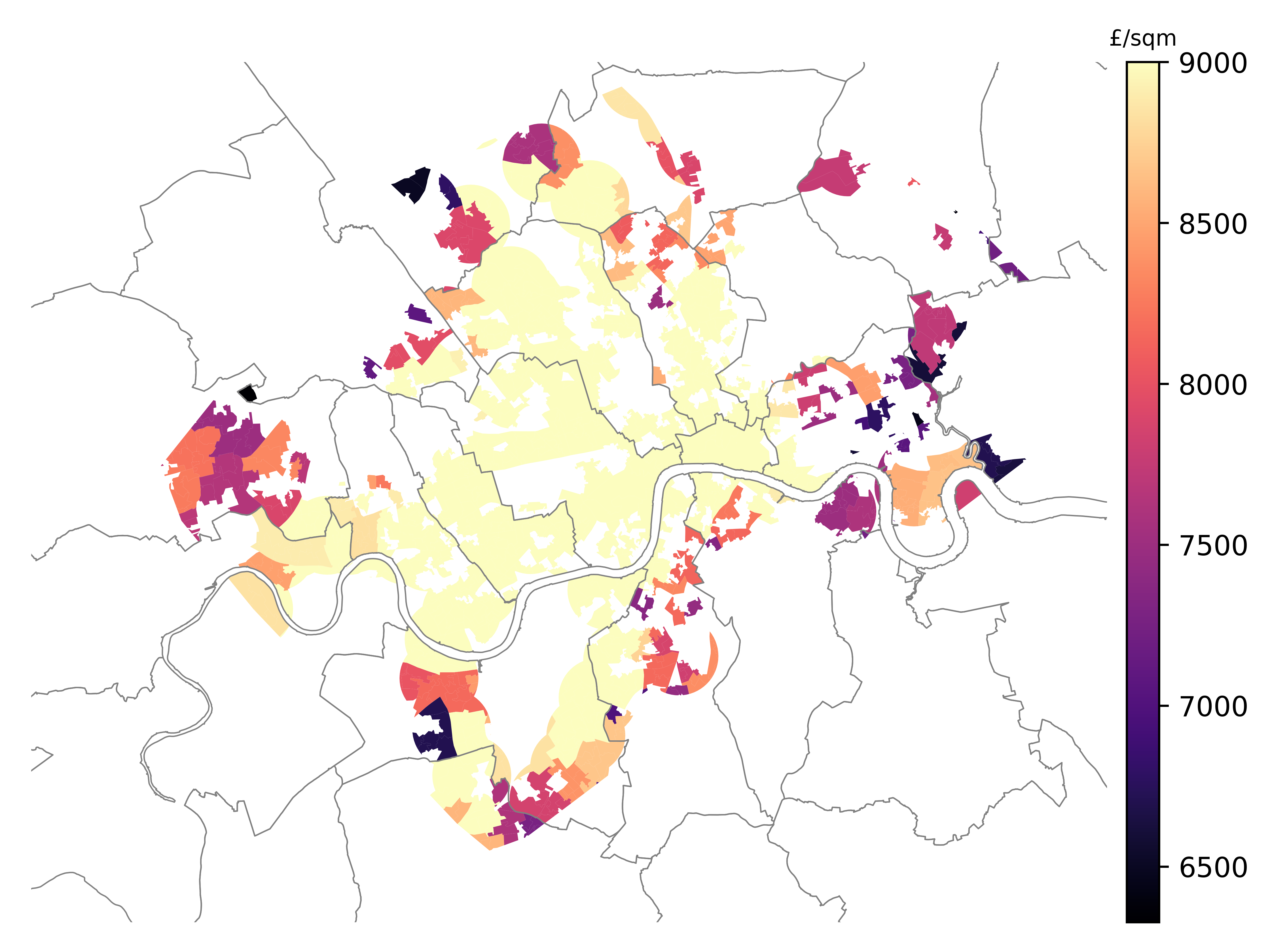 House prices (£/sqm) mapped over selected LSOAs.
Note about the colour scale: prices in the central area, as expected, are exorbitant. When mapping, I didn’t want to waste a good portion of my colour scale on price ranges that are far from my reach anyway. I defined a maximum value of £9,000/sqm on the scale so I could take better advantage of colours in the range of my interest. Thus, everything with average prices over £9,000/sqm is shown in yellow. In contrast, the more purple/dark, the more affordable the area is.
Step 7. Adding back census context
I am interested in areas in dark colours in that last plot, because the yellow ones are too expensive. But what about the white areas? They contain a mix of cases: some places could be areas that didn’t score high in my target census variables. Others may have scored high but didn’t have a tube station within walking distance.
Those two cases are quite different, and it would be useful to make that difference clear on the map too. An area that I excluded from my options only for not being served by the tube could still be valuable for me if it is next or close to where I live. It might not be where I’ll go take the tube, but it may be where I meet friends or find a nursery/school for my children.
Hence, I added back to the map all those areas above my census threshold, that were excluded by distance to a station. They are shown in grey.
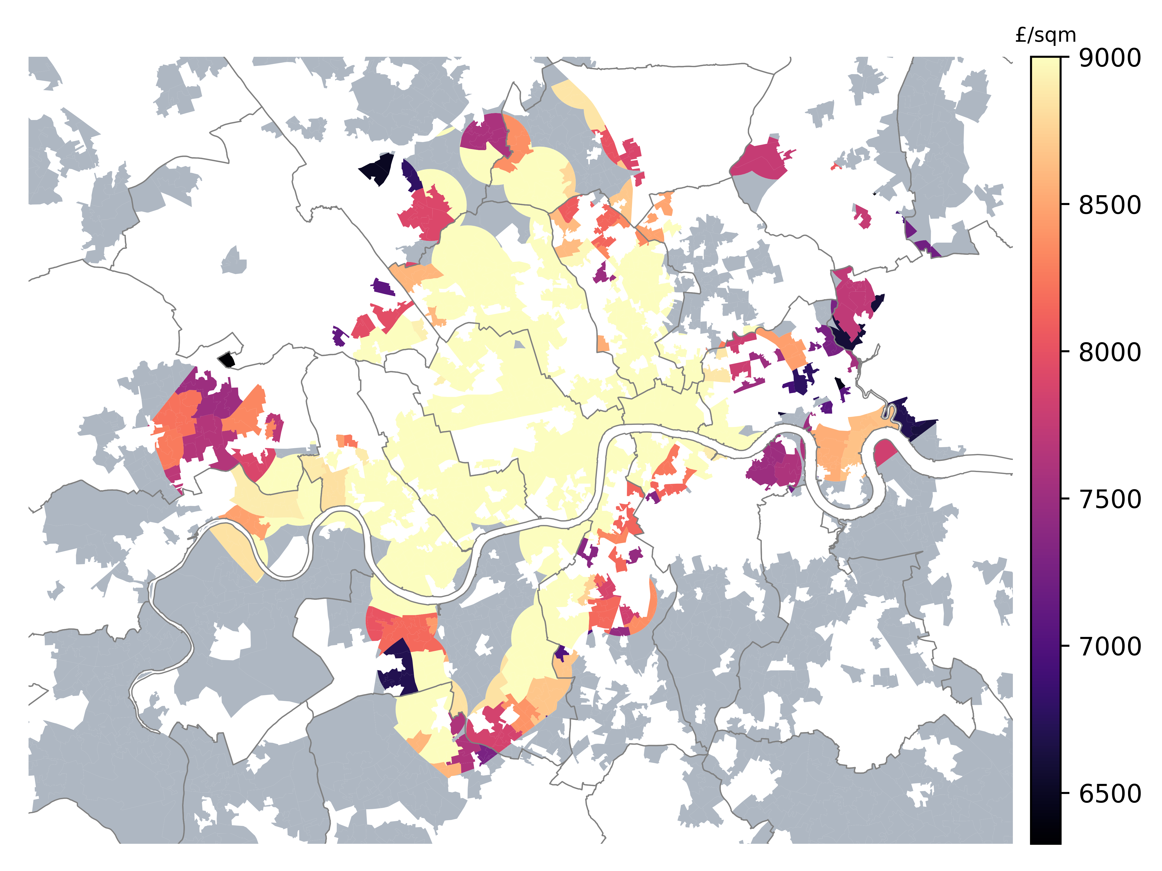 House prices (£/sqm) mapped over selected LSOAs, with census context.
My ideal areas would be those that have orange to dark purple shades on the colour scale, and that are surrounded or next to other coloured areas (i.e. including yellow and grey).
Step 8. Choosing candidate areas and adding tube stations for context
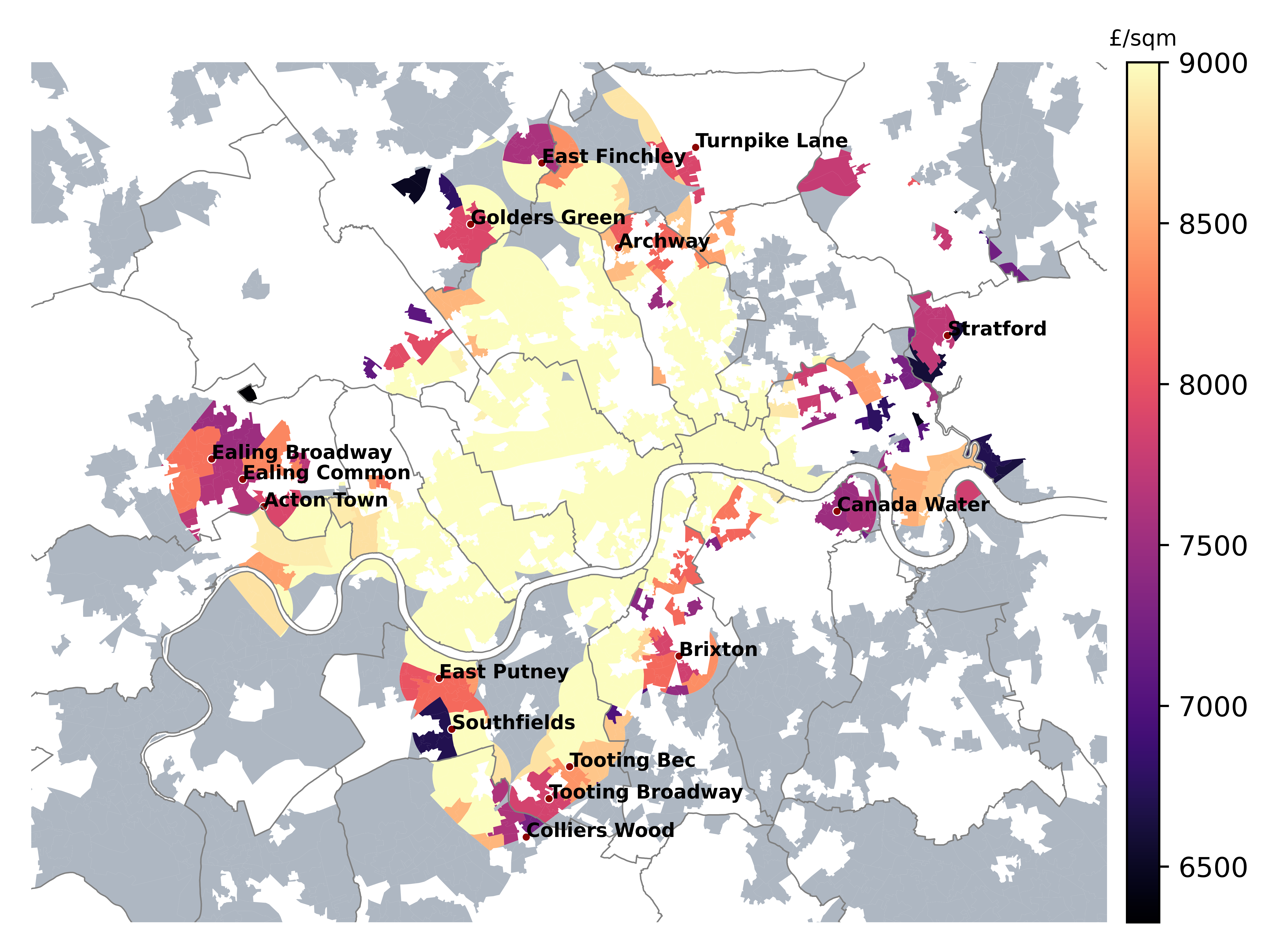
As a final step, I selected candidate areas and added the respective tube station names for each of them:
House prices (£/sqm) mapped over selected LSOAs, with census context and selected underground stations.
For extra context, we can also plot those same selected tube stations on the initial Census score map (zoomed in to the area of interest).
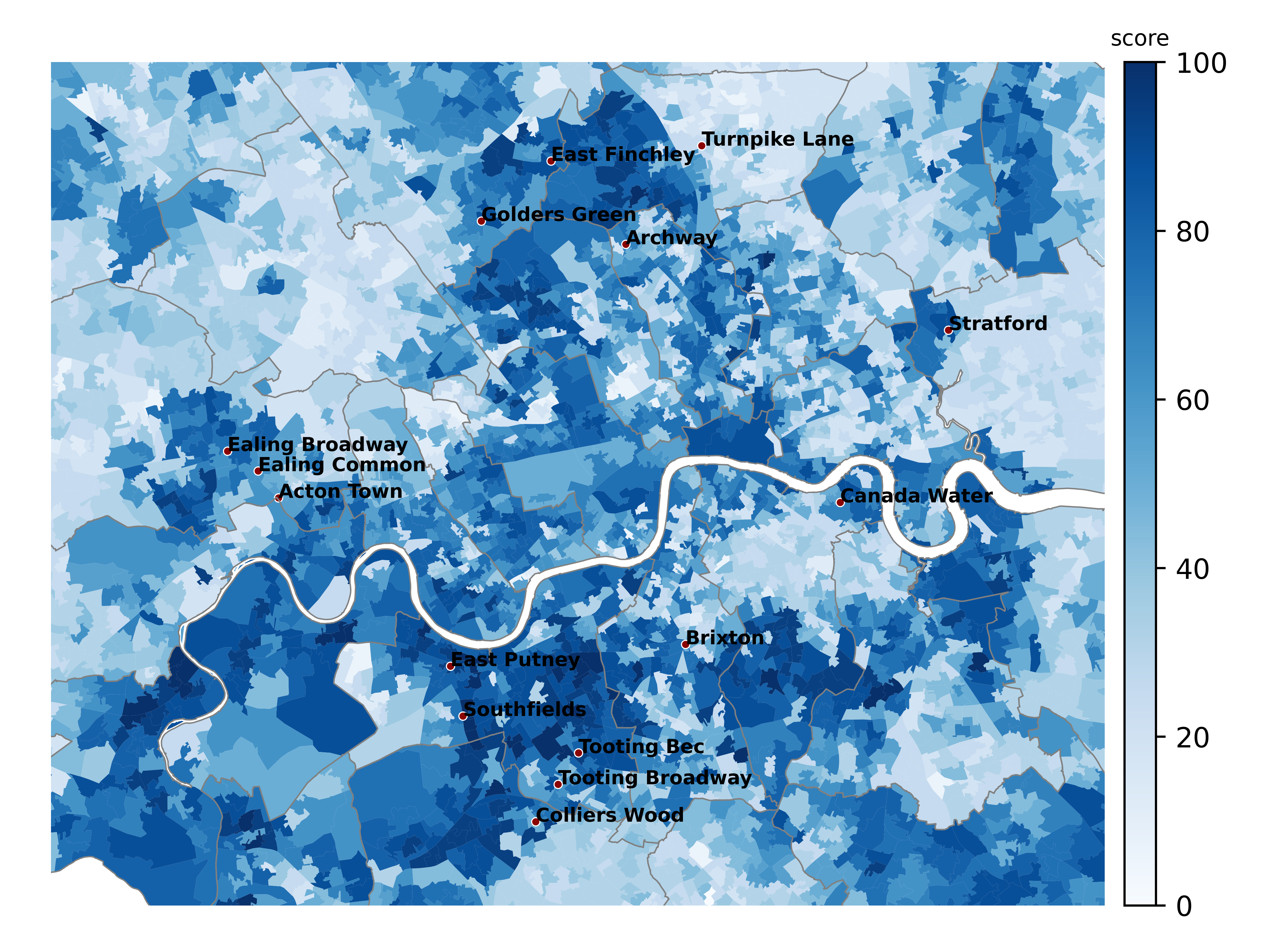 Census score and selected underground stations.
Final words
This concludes the sequence of steps. We’ve narrowed it down to just 15 stations in a few very specific areas of the city. That’s really impressive considering there are over 270 stations in the network. And not to mention all areas of the city without a station that we were able to discard as well.
A final check could be looking for proximity to parks from each candidate area, or any other feature that was important for us. Which of the final candidates to choose could be down to personal preference or background. If I had family or friends in West London, I would probably be more inclined to stay in the West. If I worked in North London, I may prefer one of the options in the north, etc.
Admittedly, not all places within walking distance of a station would be equally well connected. For example, some may be on Underground lines that don’t run during the night (e.g. Putney). Some areas may be many stations away from the first interchange to other lines, resulting in a loss of convenience. On the other hand, some stations may be served by more than one line at a time (e.g. Ealing), which is obviously better than just one. All this could also be taken into account when choosing between the final candidates.
Personally, I made my choice and went on the home hunt in one of these carefully selected areas. Now I hope it can inspire someone else too.