London, one of the most visited cities in the world, extends far beyond the well-known tourist landmarks. Driven both by those seeking a place to call home as well as by investors looking for returns, the demand for property in this global city has given rise to a dynamic real estate market.
In this post we’ll dig into the data behind London’s house prices, focusing on their trends and regional patterns.
Data sources
Online property portals in the UK usually provide little or hard-to-find information on floor size, emphasizing total price instead. The same can be said of the Land Registry data. However, for a more meaningful comparison of house prices in different regions of the city, I wanted to analyse prices per area (£/sqm). After some research online, I found a fantastic work done by authors from University College London and made available online here. They combined Land Registry data (which contains prices of every property transaction) with Domestic Energy Performance Certificates – aka EPC (which contains the floor size of each property), thus giving the price per square meter of every house transaction in the Registry since 1995.
To put the data into geographical maps, I’ve also used shapefiles with London administrative boundaries taken from the Open Geography Portal run by the Office for National Statistics (e.g. Wards here). I’ve complemented the UCL data with extra information by Post Code, taken from the same portal.
After importing all data and filtering for London, we are left with 2.7 million records for the period 1995-2023.
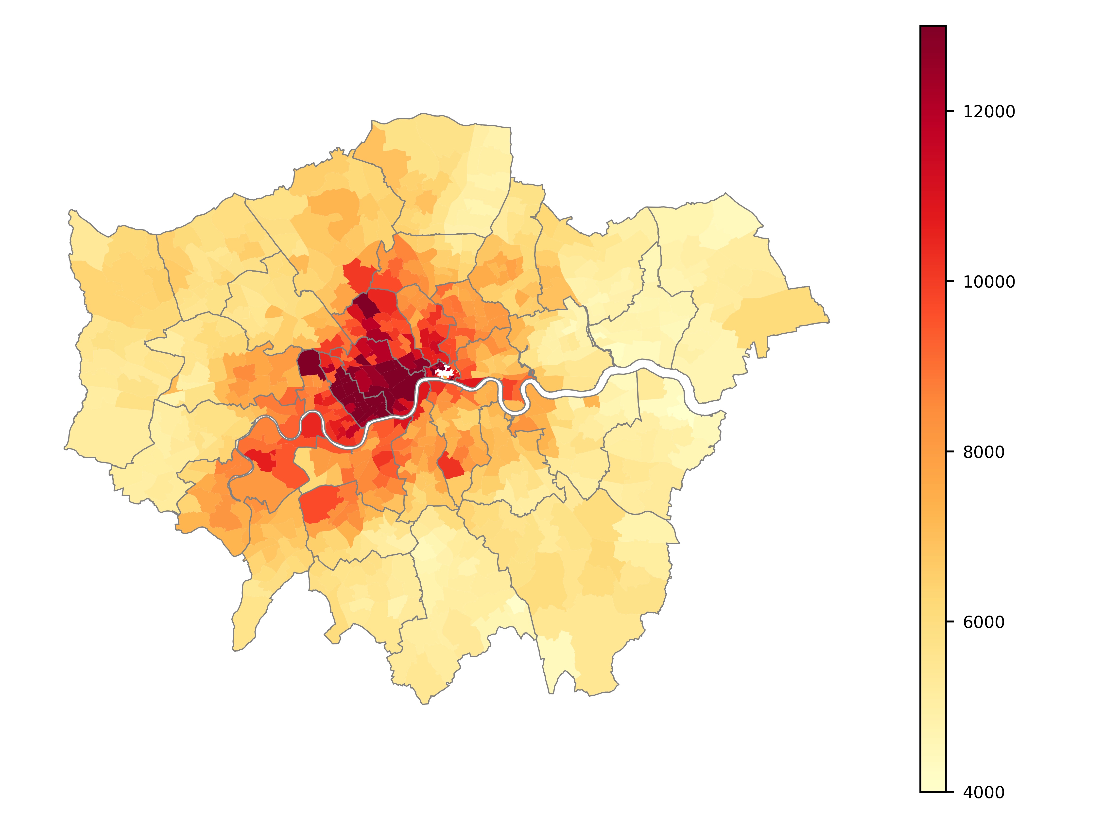
Map of Current Prices
We can visualise how current prices vary across London by plotting them on a map. I chose to aggregate results by Ward, as it gives a nice granular detail level across the city, without the risk of being too small to contain enough transactions in each unit. The map below shows median prices by Ward for transactions in the last 3 years (2021-2023), and excluding outliers (extreme transaction prices per sqm).
Or we can also look at it on an interactive map, which provides much more geographical context, although at the expense of a lighter colour scale:
Prices in central London comfortably exceed 12,000 £/sqm, while far in the outskirts they can drop to around 4,000-5,000 £/sqm.
There are innumerable insights we can get by examining these maps. Some of my favourites are the clear demarcation between the Borough of Kensington and Chelsea and the Borough of Hammersmith and Fulham; the concentrated hotspot of higher prices around Canary Wharf; and how the Borough of Harringay seems to have a clear division of east-west in prices, tracing the path of the Great Northern Railway.
How Prices Evolved in the last 30 years
One of my motivations for starting this analysis was understanding how different neighbourhoods had evolved in value over the last years. We could plot the median price per Borough over the years, but we would get this very questionable chart:
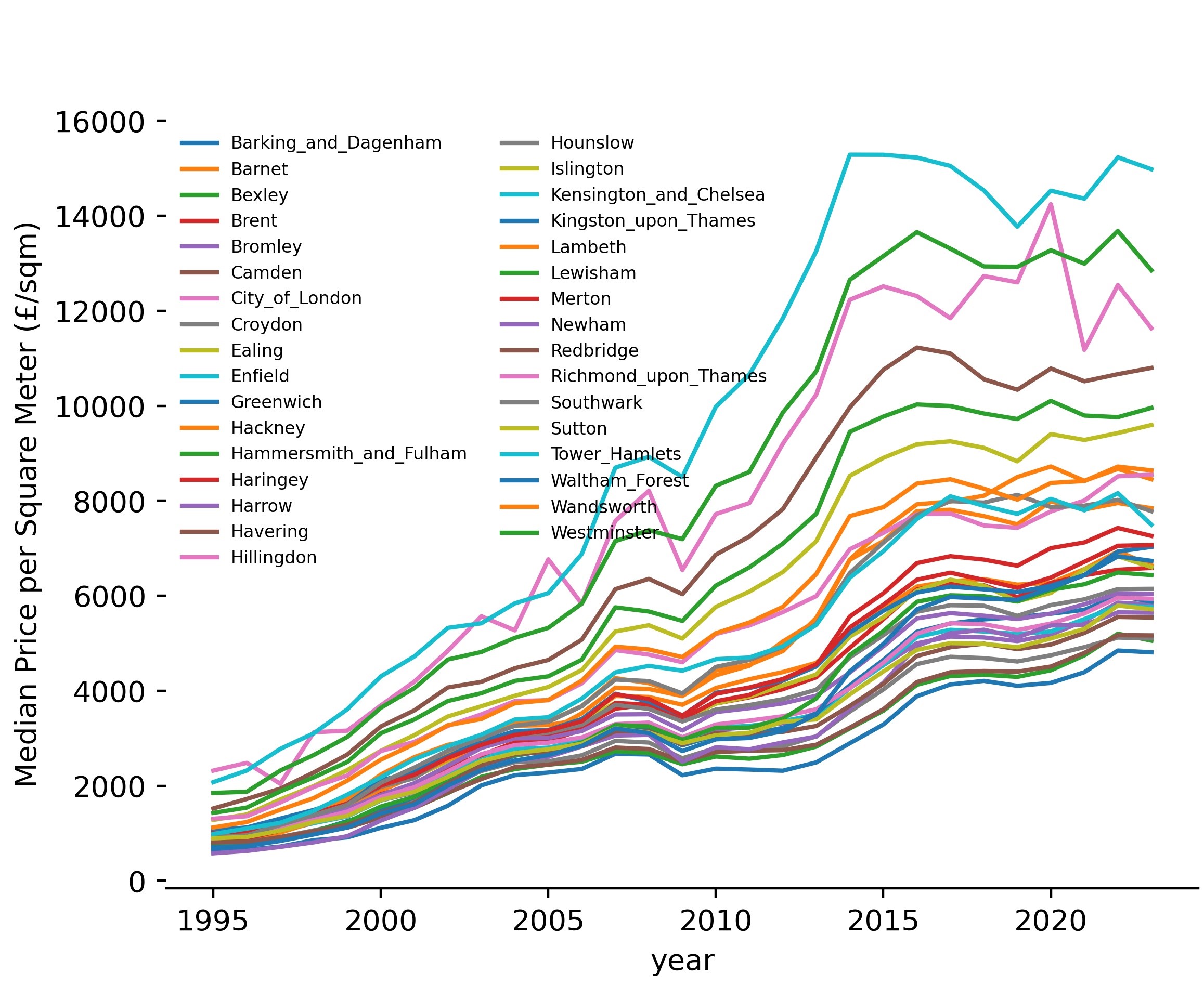 The merits of this chart are mostly allowing us to see that all Boroughs considerably increased their prices over time, with prices in 2023 being around 7 times those in 1995. We can also see the 2008 financial crisis impacting all boroughs, and prices generally recovering at a similar pace.
But other than that, this chart has major limitations:
- There are so many boroughs that it is almost impossible to know which is which.
- It is easy to see all boroughs went up in prices, but not which one went up the most or the least. Or, in more general terms, if prices for a borough were changing faster or slower than the average.
- It only shows prices for Boroughs, which are a rather coarse geometry within the city. Finer trends by Ward remain undetected.
- The name of the boroughs says nothing about their geographical proximity, missing the possibility of detecting trends on a bigger scale (such as a whole region of London).
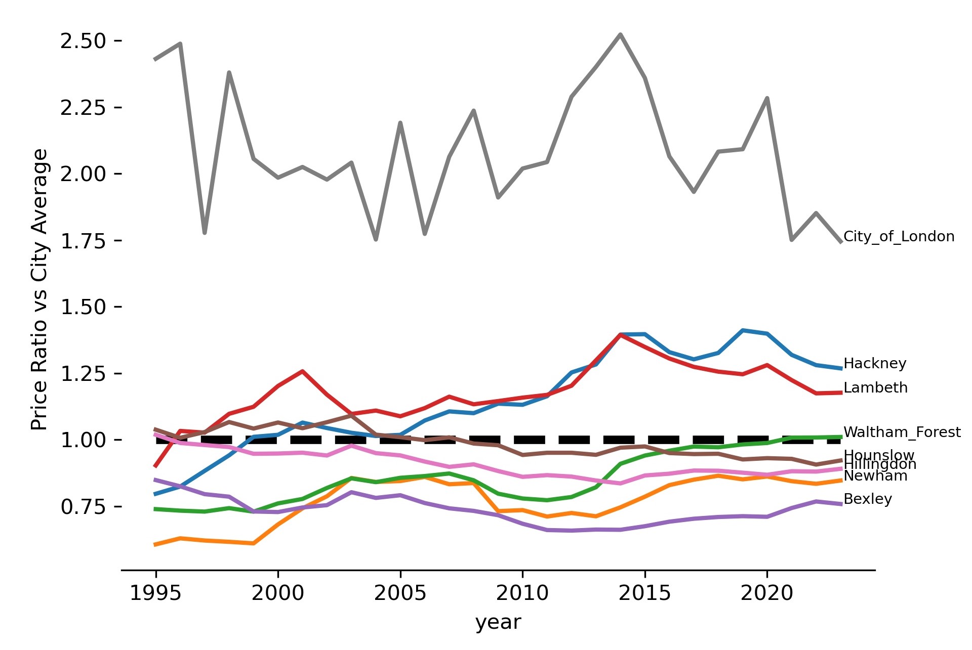
To better depict the relative price change of a borough vs the price change of others, I introduce the following Price Ratio:
Ratio = Median Price per sqm of Ward or Borough / Median Price per sqm of London
For example, ratios higher than 1 indicate that houses in that particular ward are generally more expensive than the average for London in that same period of time.
To address all other issues, the best thing to do is to put prices into a map - again. But this time, we also need to incorporate time into it.
The result is this beautiful animation, where green represents prices below the city’s average, red represents above-average prices, and yellow tones indicate around-average prices:
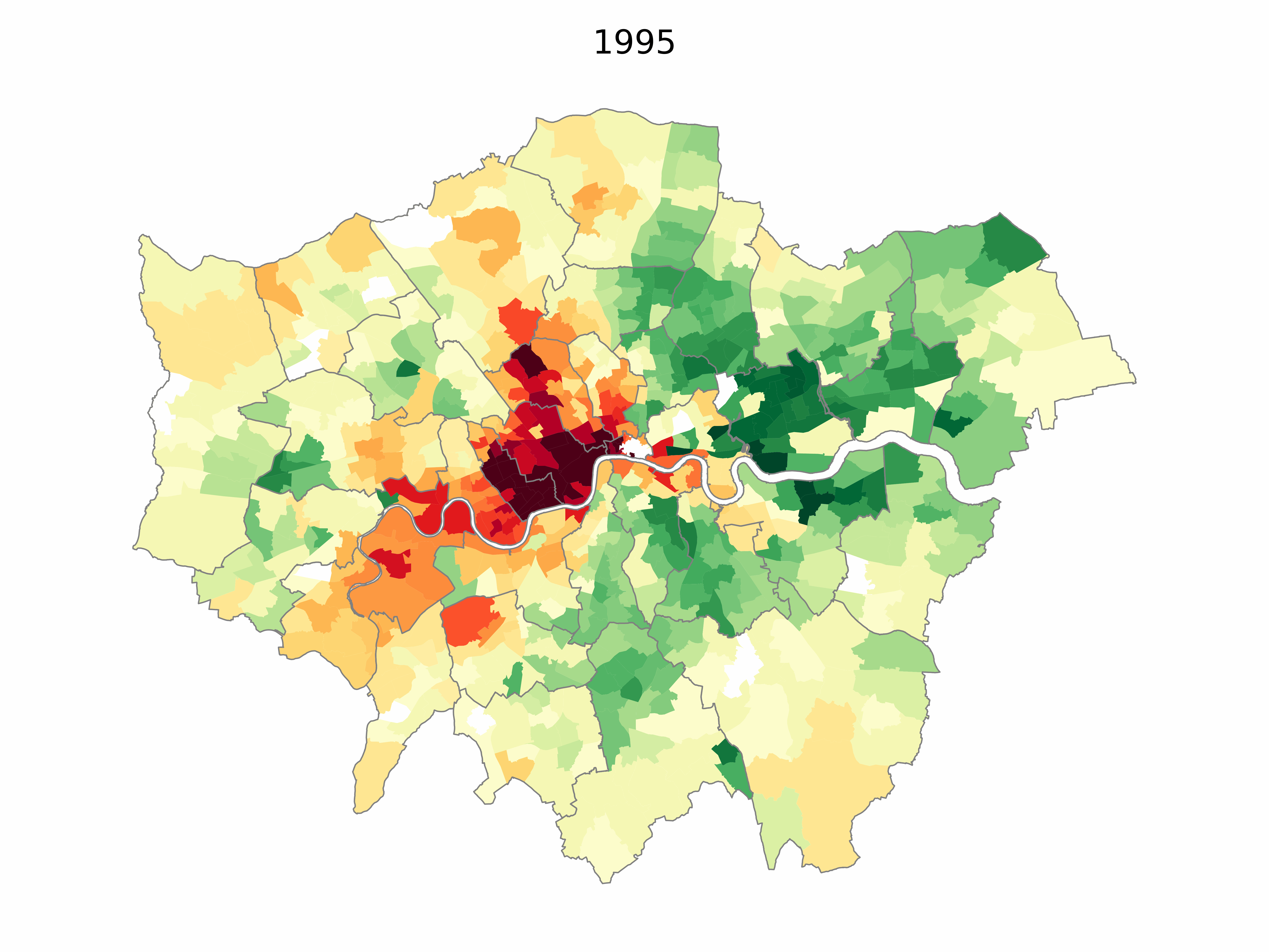 Watch it closely, and you will notice how the East of the City saw a dramatic increase over the years. Especially most of the Borough of Hackney, and specific areas of the Borough of Newham (e.g. Stratford).
Below, we can see a chart of how this Price Ratio changed over time but only for the top 4 and bottom 4 performing Boroughs.
 More details on those specific boroughs can be seen in the following tables:
| Top Boroughs | Ratio 1995 | Ratio 2023 | Change Factor | Price 1995 | Price 2023 | Change Factor |
|---|---|---|---|---|---|---|
| Hackney | 0.80 | 1.27 | 1.6 | 760 | 8,454 | 11.1 |
| Newham | 0.61 | 0.85 | 1.4 | 579 | 5,644 | 9.8 |
| Waltham_Forest | 0.74 | 1.01 | 1.4 | 705 | 6,734 | 9.6 |
| Lambeth | 0.90 | 1.18 | 1.3 | 862 | 7,843 | 9.1 |
Three of the boroughs with the highest price increases are in the East: Hackney, Newham and Waltham Forest.
| Bottom Boroughs | Ratio 1995 | Ratio 2023 | Change Factor | Price 1995 | Price 2023 | Change Factor |
|---|---|---|---|---|---|---|
| Bexley | 0.85 | 0.76 | 0.9 | 809 | 5,056 | 6.2 |
| Hounslow | 1.04 | 0.92 | 0.9 | 990 | 6,146 | 6.2 |
| Hillingdon | 1.02 | 0.89 | 0.9 | 972 | 5,937 | 6.1 |
| City_of_London | 2.43 | 1.75 | 0.7 | 2,319 | 11,633 | 5.0 |
While 2 of the boroughs with the smallest increases are in the West: Hounslow and Bexley. The City of London was the Borough with the slowest increase in prices over this period.
So, if back in the 90s and early 2000s you had funds to invest in London and were aiming for an interesting financial return, I hope you opted for Hackney.